
Mobile Apps Design: LayGo
Designing a mobile app for Travel Marketplace
What is LayGo?
LayGo is a travel marketplace app in Indonesia designed to connect travelers with travel agents, allowing travelers to explore various travel service options offered by different travel agents. LayGo enables travelers to book trips that match with their needs and wants.
Laygo was designed specifically for Indonesia, with both Indonesian and English components
Project Details
Role :
UI/UX design, End-to-end product design
Client :
Bootcamp project (personal work)
Tools :
Figma, Figjam
Project Duration :
Feb - May 2024
Problem Discovery
Travelers face challenges in finding a travel agent service that meets their specific preferences and desires
When planning a vacation, it’s difficult to compare the numerous travel agents and tour operators scattered across social media, especially Instagram and TikTok, in terms of price, destination, facilities, and trustworthiness.
With limited references from ads or friends, it becomes even more time consuming and challenging to find reliable agents, especially for unfamiliar destinations, while also dealing with concerns about potential fraud or scams.

How might we help travelers find a trip that match their needs and wants?
Solutions
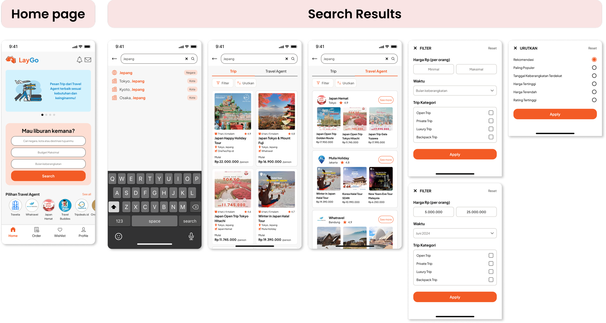
A travel marketplace app that allows travelers to search, compare, and book trips from travel agent services within a single apps
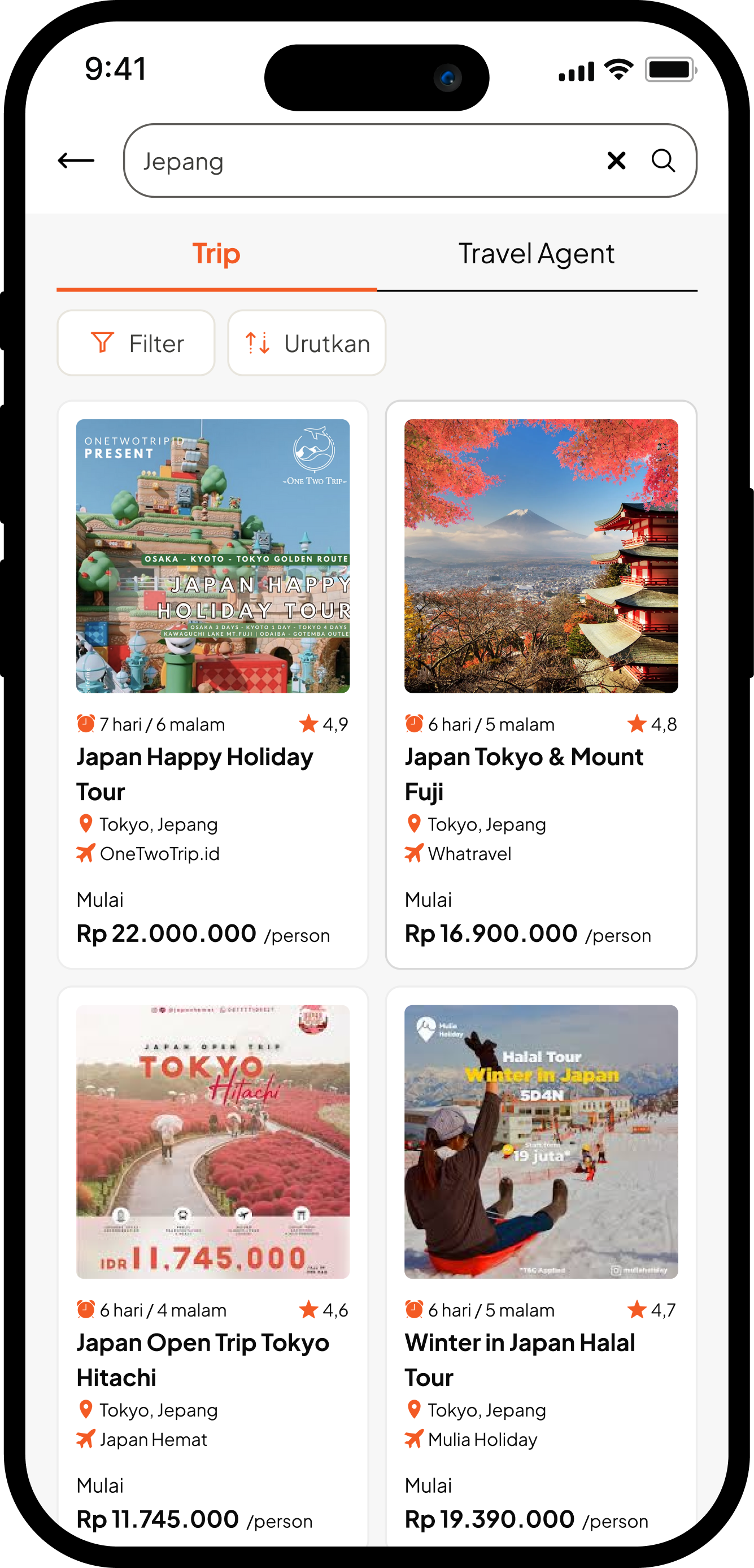
1. Search trip destination
Display a list of trip offers from various travel agents based on the traveler's desired destination, budget, and departure time.
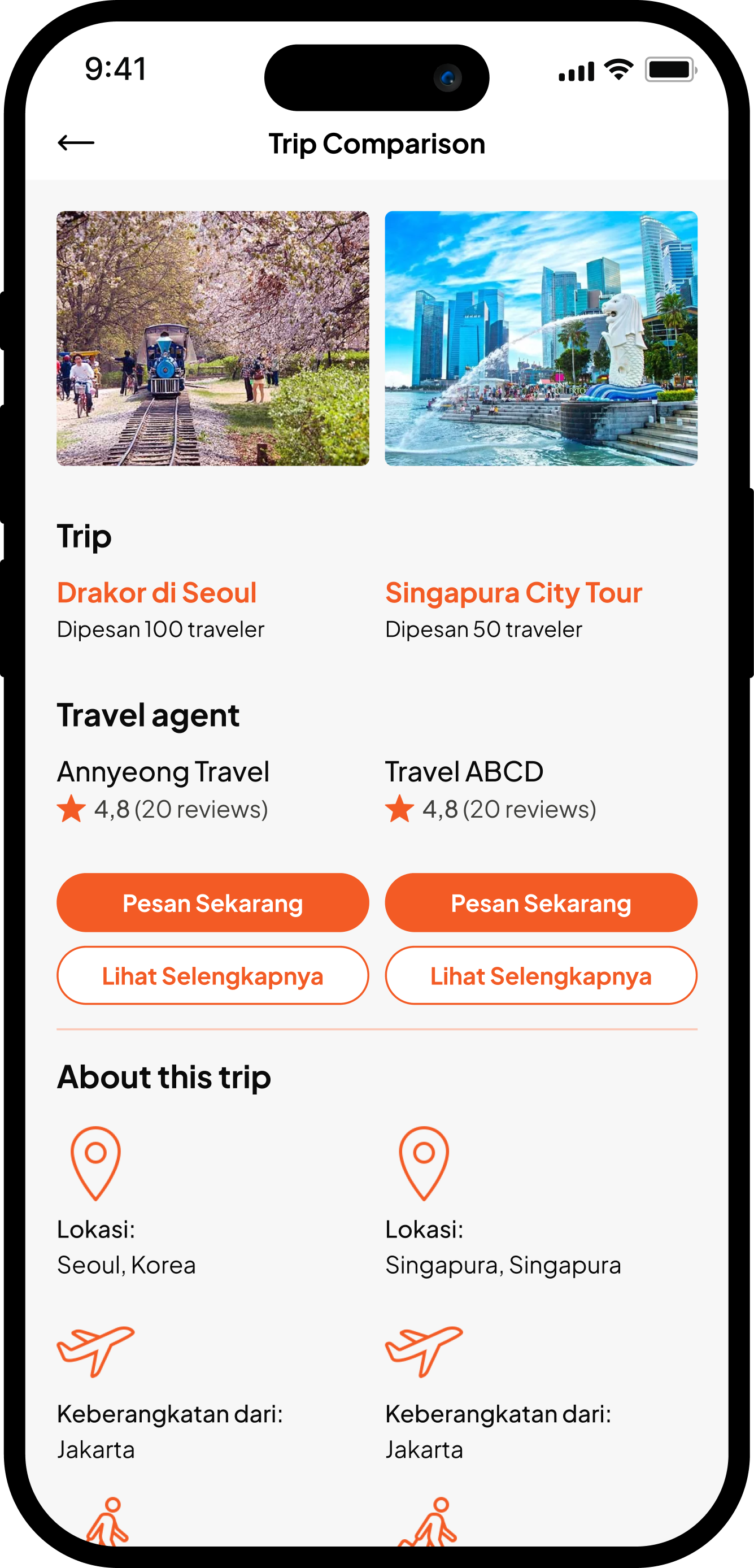
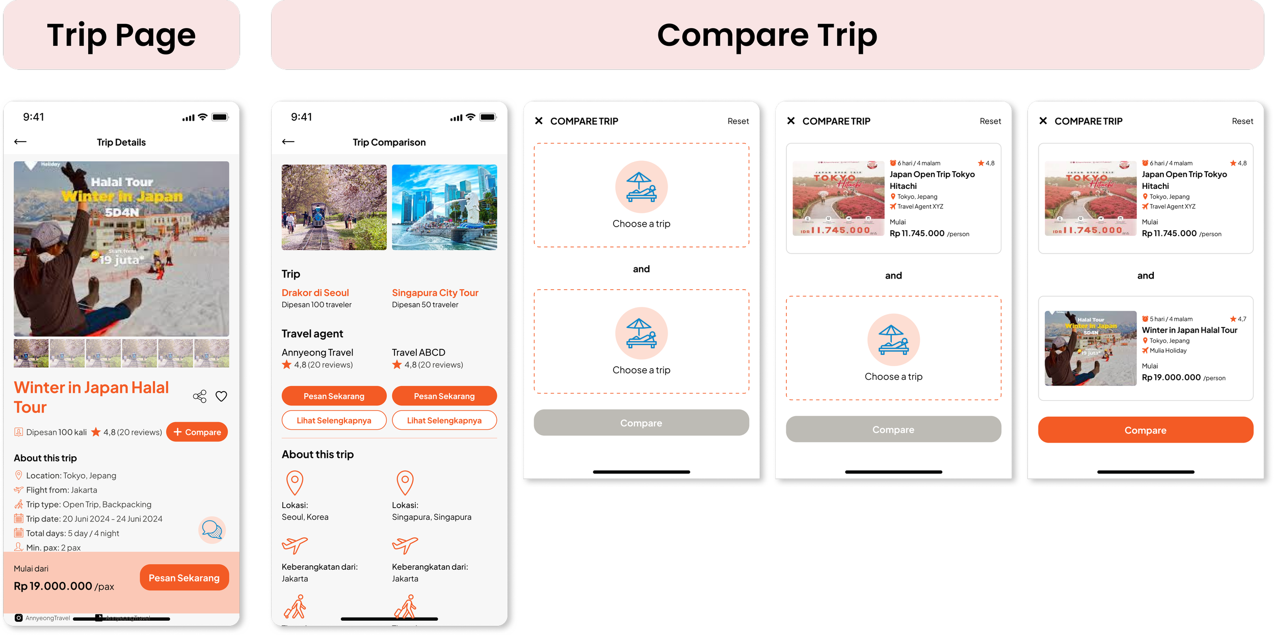
2. Compare trip offered
Allows travelers to compare the facilities and offer details of two different trips.
3. Book their favorable trip
Travelers can make direct bookings through the apps.

Design Process
Through this comprehensive process, I have pinpointed user pain points, developed actionable ideas from users, and compiled essential information, all of which are crucial in effectively solving travelers challenges.
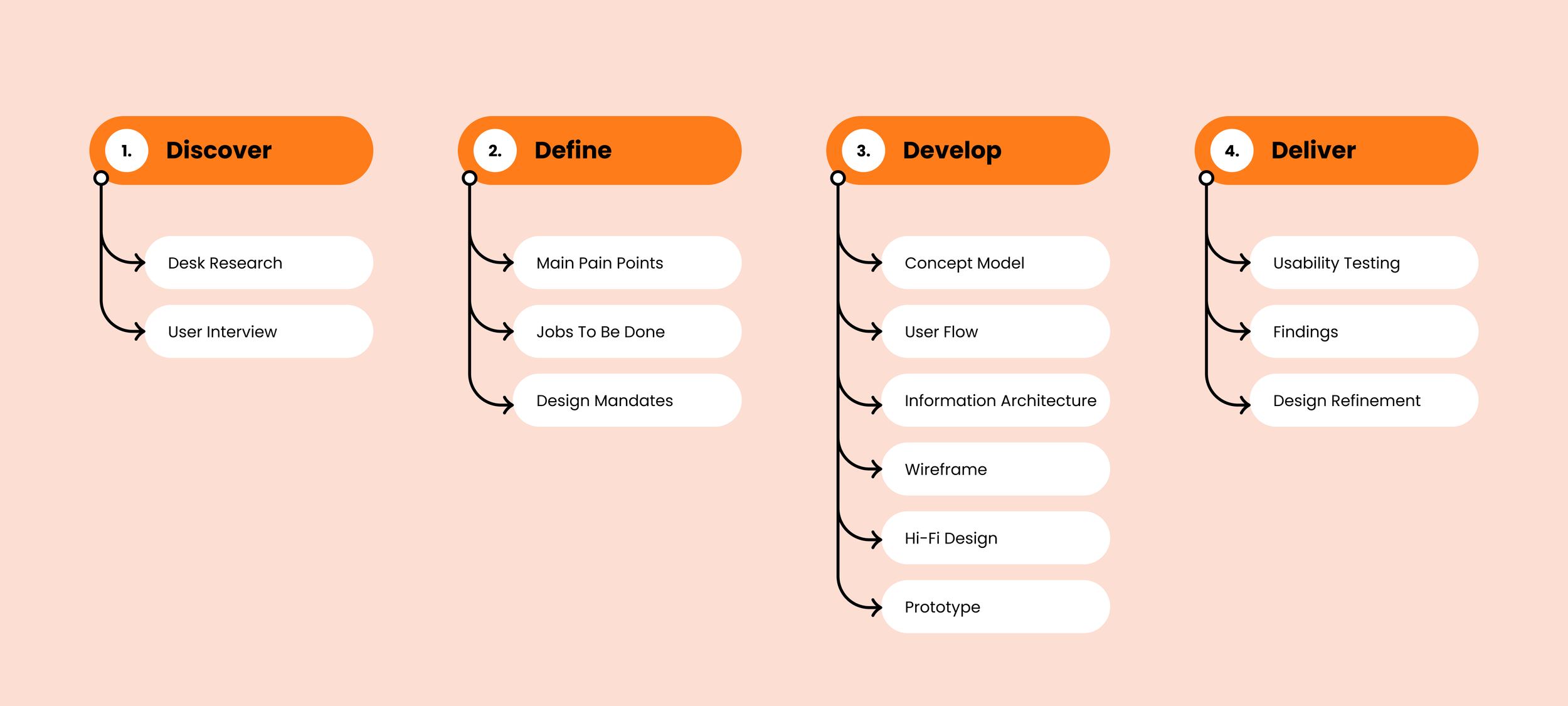
DISCOVER
Desk Research
Based on Ministry of Tourism and Creative Economy’s data, I dig some fact:
The number of domestic tourist trips in 2023 reached IDR 749 million (year-on-year growth of 11.9%).
The average expenditure of tourists in 2022 was IDR 2.7 million per person.
Most Indonesian tourist activity is still concentrated around the island of Java. Meanwhile, the government has designated five super-priority tourist destinations: Lake Toba, Borobudur, Mandalika, Labuan Bajo, and Likupang.
Supporting above data, based on google trends data, the keyword “Travel Agent” and “Open Trip” are continuously searched by people in Indonesia.
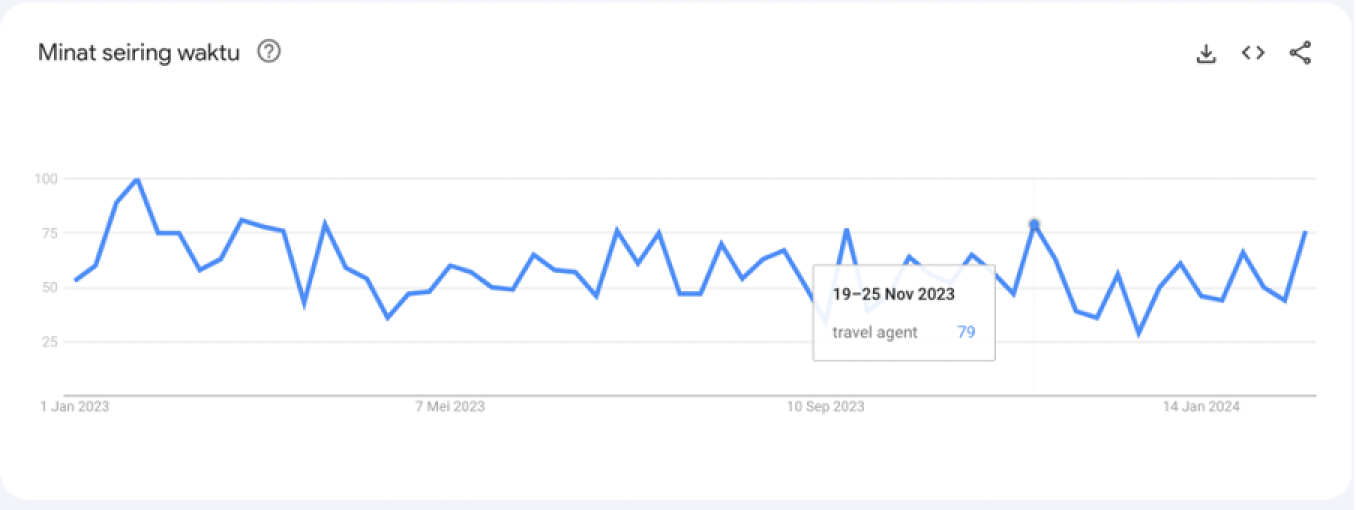
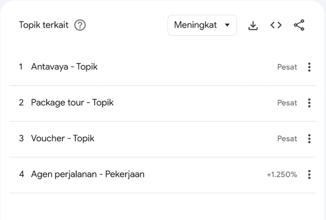
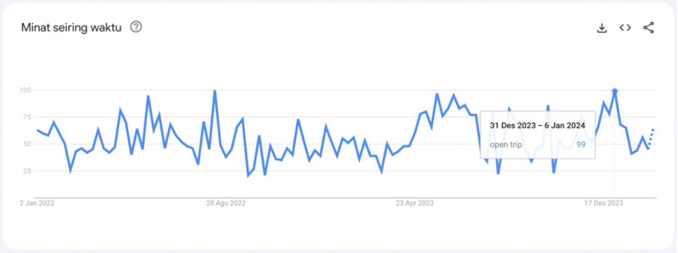

The data indicates a demand in the Indonesian market. With limited competition in this sector, there is a significant opportunity to stand out as a pioneer and leader in this service.
User Interview
How are travelers addressing the need for traveling?
I conducted user interviews with 8 users, between 25-30 years old with expected traveling plans between 1 to 3 times per year.
Traveling Preferences (%)
Services used through a Travel Agent (%)
Expected outcomes
Understand the needs and challenges of users/travelers when planning a vacation trip
Identify common behaviors and experiences before, during, and after traveling
Understand the process and emotional experience of selecting travel destinations and travel services
Identify travelers' needs for travel agent services
DEFINE
Analyzing the user interviews
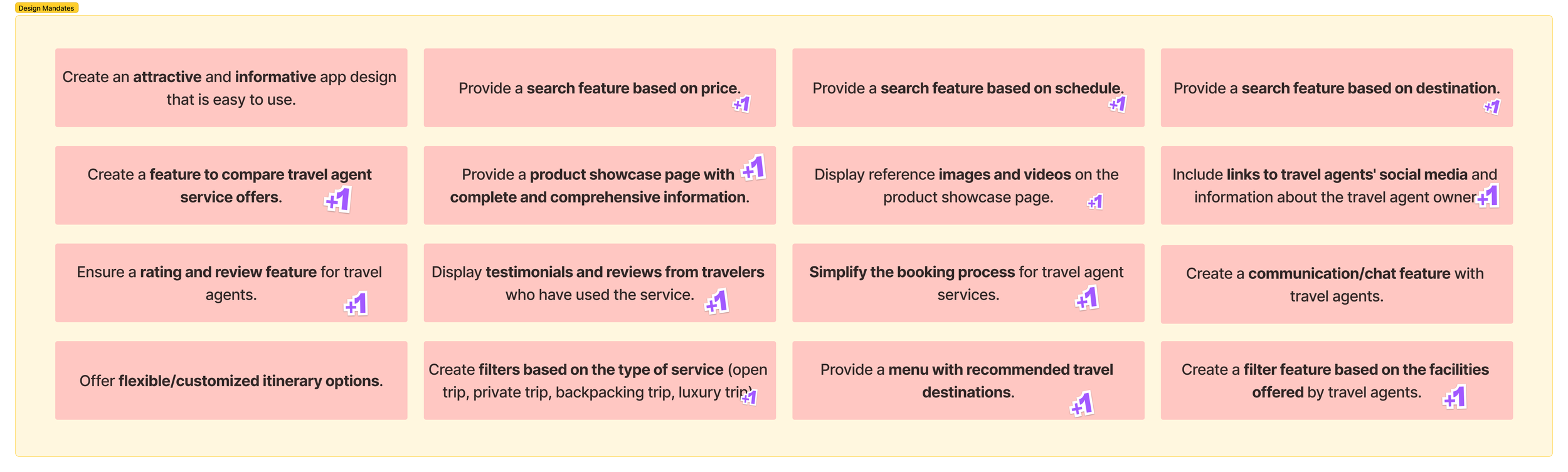
In the affinity diagram, I explored what are the user needs, what are the user problems, and grouped all the data into similar categories to easily define the design mandates.
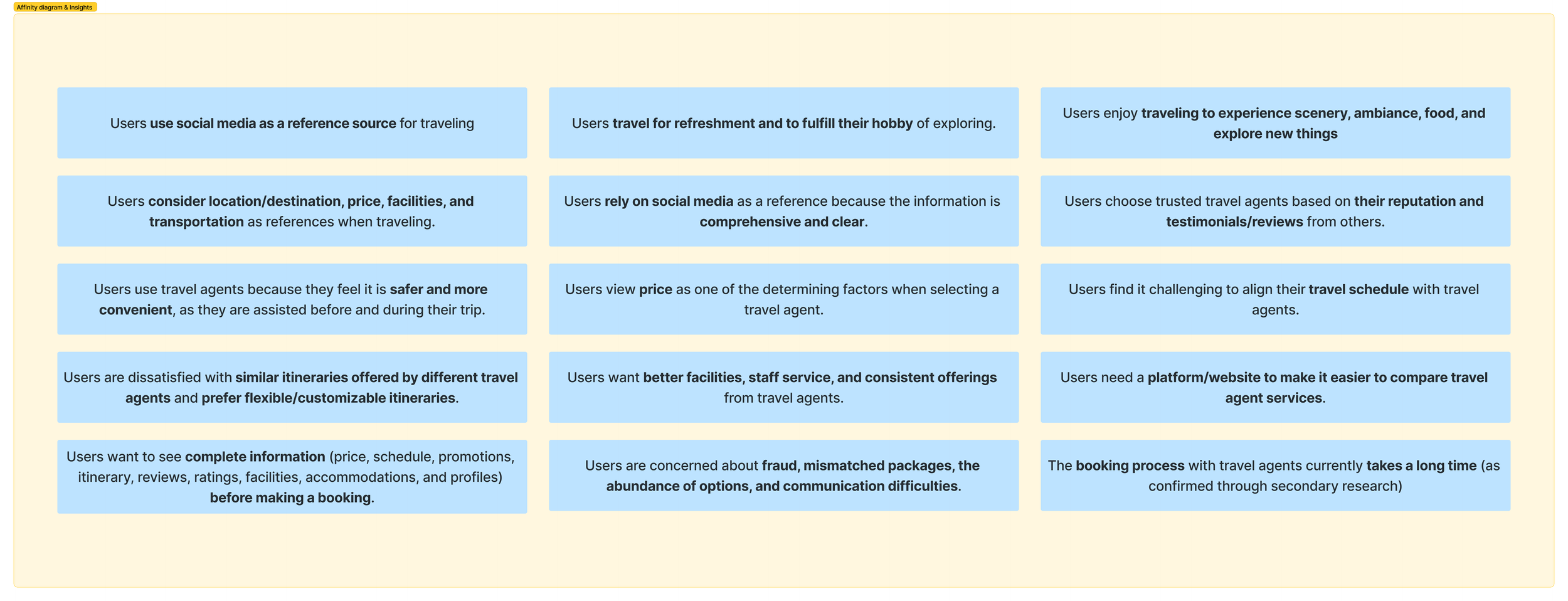
Affinity Diagram to Design Mandates
The affinity diagram helps me identify the key points that should be implemented into the app.
Defining Jobs To Be Done (JTBD)
Based on the design mandates, I created “Jobs to be done” to identify and understand the specific tasks I must achieve as a designer to meet user needs..
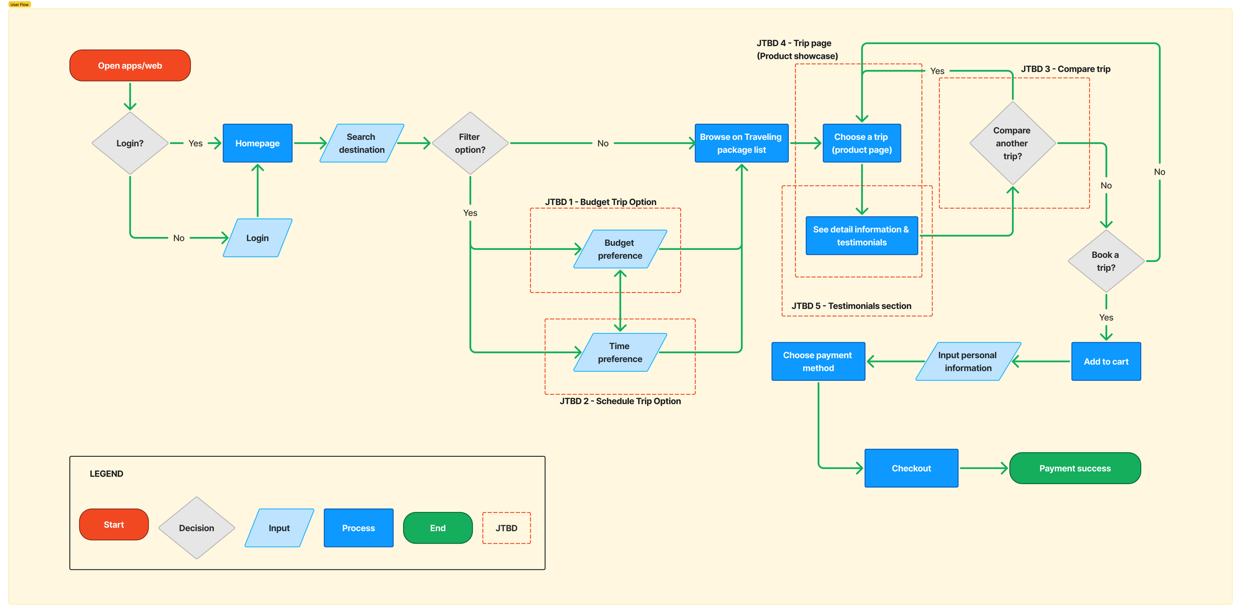
JTBD 1 - Budget Trip Option
As a traveler, I want to be able to search for destination filtered by price, so that I can traveling within my budget
JTBD 2 - Schedule Trip Option
As a traveler, I want to be able to search for destination filtered by time, so that I can get trip recommendation based on my holiday’s schedule
JTBD 3 - Compare Trip
As a traveler, I want to compare available trip offered from different travel agent, so that I can see which offer is the best deal for me
JTBD 4 - Trip Page (Product Showcase)
As a traveler, I want to know what’s included in the trip, so that I can make sure the offer fits my needs and wants
JTBD 5 - Testimonials
As a traveler, I want to see others’ review before ordering, so that I can make sure this travel agent is trusted and credible
DEVELOP
Visualizing The Concept Model
I defined a conceptual model to map a representative system which shows the interaction between users, features, and pages.

User Flow
Following that, I created a user flow diagram to represent the steps users take through the entire product journey, incorporating the defined JTBDs.
Information Architecture
I followed these four steps to define the information architecture:
1. Estimating the total number of pages required based on the user flow.

2. Defining content pages to indicate what elements or content will be present on each page.


3. Developing metadata to specify the components and their respective content.
4. Creating a general navigation to outline the content that will be included in the apps.

For a more detailed view, the complete information architecture can be accessed via the following link.
Mid-Fidelity Wireframe
Wireframes are not just grey boxes; they are the foundation of our design. I created three wireframe versions, each leading to a different design outcome. As a designer I focus on users problem, assuring that users are’t confused with our homepage.


Mid-Fi Wireframe
First Fold
Mid-Fi Wireframe
Lo-Fi Wireframe
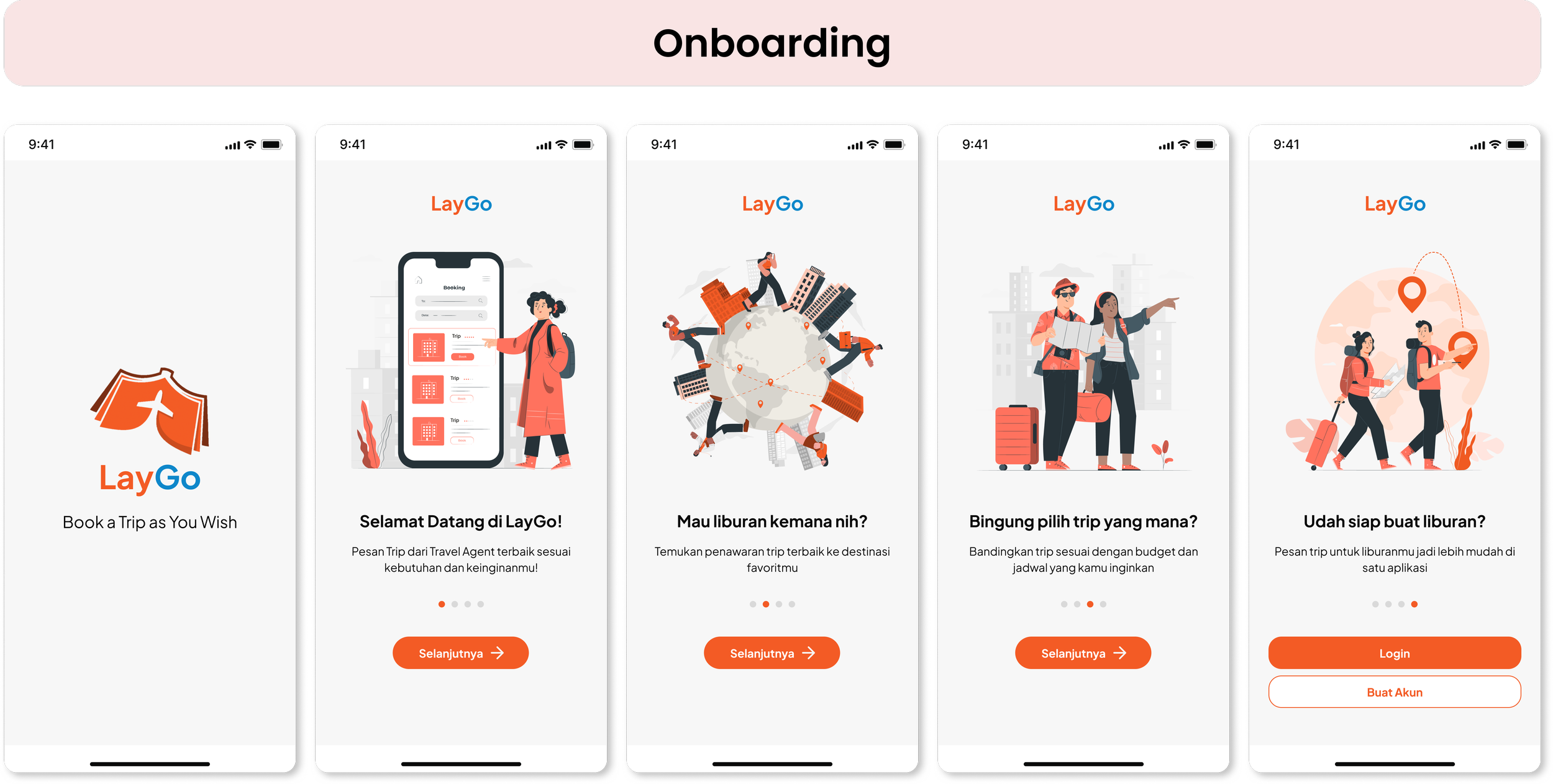
High-Fidelity Design


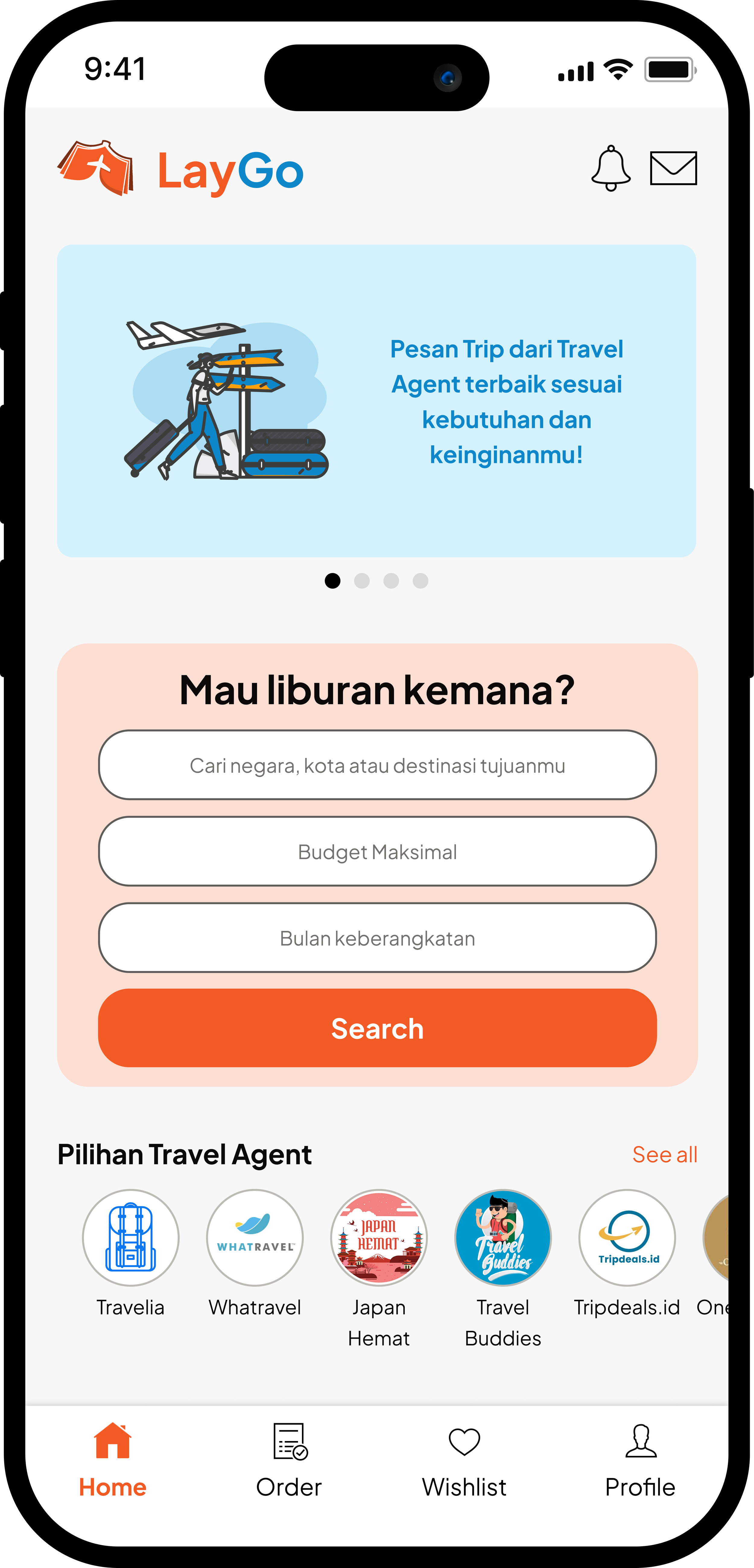
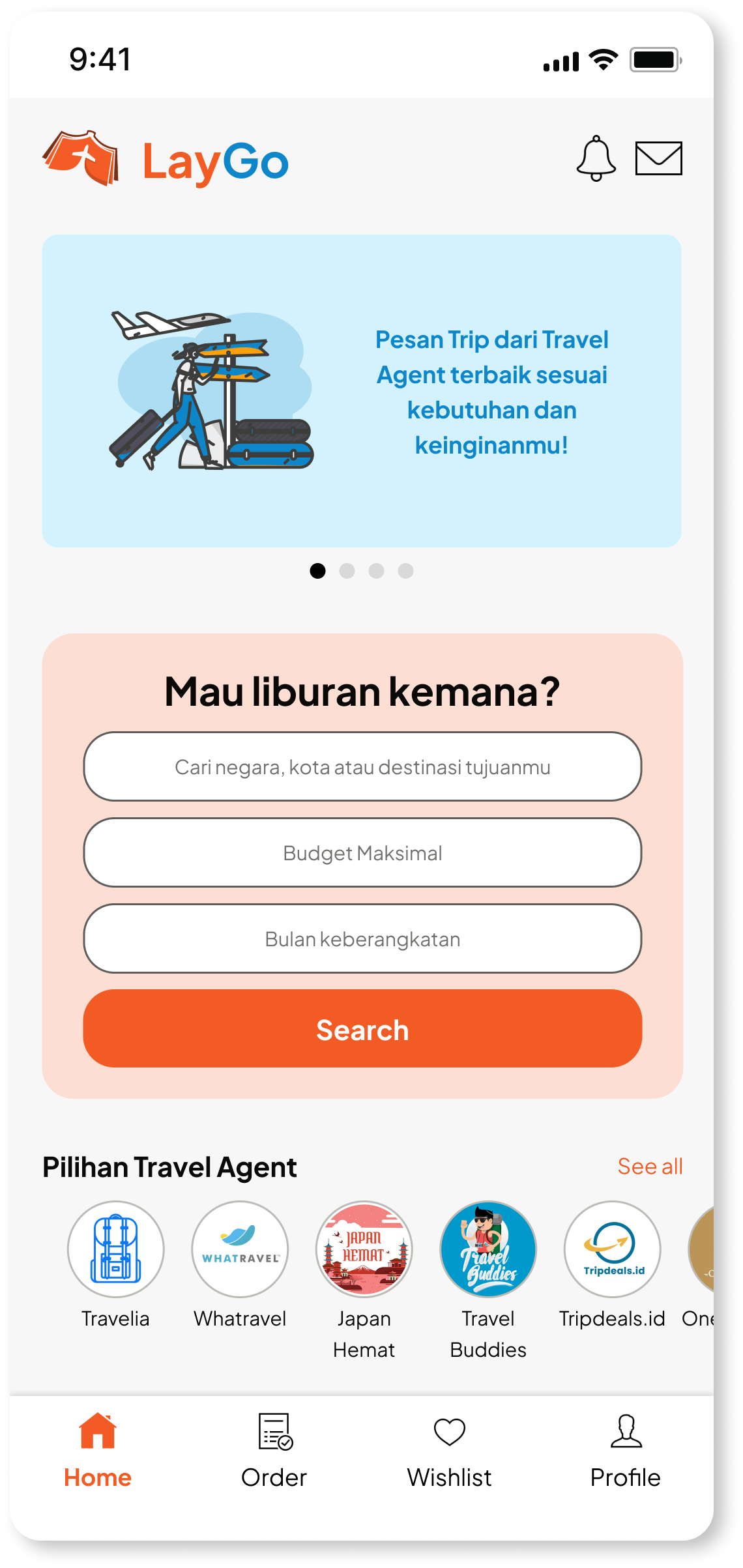
Home Page First Fold
Home Page
DELIVER
Usability Testing
I conducted a round of moderated usability testing on a high-fidelity prototype to validate the flow and gather feedback on the user experience. Respondents were asked to complete six tasks representing the entire end-to-end user flow of the product.
Based on the analysis of their behavior and feedback, I concluded several suggestions for improving Laygo’s design:
Users feel that the budget and schedule options are not instant because it requires multiple steps from filtering.
Users tend to view trip offers from travel agents they are already familiar with first.
Design Refinement
Overall, usability test was quite satisfying. The general flow proved to be viable. I made a few improvement that aimed to accommodate users’ feedback.
The design improvements were made to the homepage to accommodate the main needs of users, particularly in the 1st fold design.
The design enhancements include:
Emphasizing quick search by improving the search bar, allowing users to input their destination, maximum budget range, and preferred departure month.
Moving the travel agent list content to the first fold to make it easier for users to find travel agents they are already familiar with.
Before
After
Final Design


Reflection
Personal Learnings
This project was a journey full of challenges and learning moments that shaped my perspective on design. One of the biggest challenges was finding a fresh and compelling story to tell in the already crowded travel industry. Prioritizing features for the MVP wasn’t easy either — it required tough decisions on what to include and what to leave out. Designing the comparison feature and booking form also tested my attention to detail, as I had to think deeply about what users would need at each step to make the process intuitive and stress-free.
Through these challenges, I learned the power of simplicity. Keeping things clear and straightforward — from flowcharts to the final prototype — made a real difference in the overall experience. I also discovered the value of a well-structured UI library with reusable components and variants, which not only made the design more consistent but also sped up the entire process.