
Website Redesign: Marshall
Modular Advanced Revamp System with Hyper Learning Loops
What is Marshall?
Marshall (Modular Advanced Revamp System with Hyper Learning Loops) is a system designed to enhance the effectiveness of Learning & Development module processes within the Telkom Corporate University using Artificial Intelligence.
Marshall helps users review modules, generate modules, create questions, and upload e-books. It automates the module creation process with AI based on the desired input requirements, such as competency name, competency level, module title, learning objectives, and topics.
Project Details
Role :
UI design, Prototyping, Mini Design System
Client :
Telkom Indonesia (professional work)
Tools :
Figma
Project Duration :
June 2024 (7 days)
Project Objective
“Improving Marshall’s Generate Modul page experiences to make it more user friendly and intuitive for trainers”
As a UI/UX Designer, my role involves understanding users' mental models when interacting with the website and redesigning the interface to provide a seamless experience, enabling users to achieve their goals effortlessly.
Problem Statement
The website's design communicates the necessary functions to users, but it falls short in delivering a sense of closeness and intuitiveness. As a result, while users can complete tasks like generating teaching modules, the process may feel tedious or unnecessarily complicated due to the lack of applied heuristics.
Hypothesis
By emphasizing the application of heuristics, reorganizing the information architecture, and enhancing the user interface to be more intuitive, users can complete tasks more easily while building trust in the process.

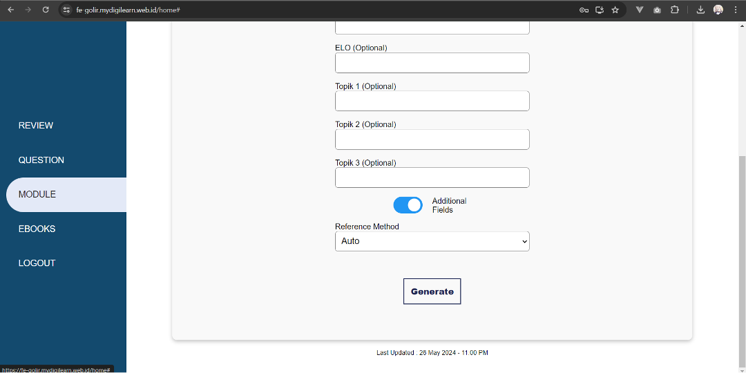
Here are the screens from the current website that outline the user flow I will be improving.


Research
1. User Reviews
To gain a deeper understanding of how Marshall's users feel and to identify potential issues, my first step was to gather their honest reviews and feedback about the website. I reached out to three users for their input.
"The information structure feels unclear and hard to follow."
"It's confusing because there's no complete information provided for each task."
"The content feels disorganized, which makes it seem more complicated."
"The design doesn't feel visually appealing or engaging."
2. Heuristic Evaluation
To quickly identify potential issues with flow, information, and heuristics within the time constraints, I explored Marshall's website myself, testing the Generate Module feature to experience it as a first-time user.


Consistency and standards
The flow lacks a consistent rhythm, making it difficult for users to anticipate the next step or identify the information needed for the primary action form. Furthermore, the primary and secondary action forms appear indistinguishable from each other.
Recognition rather than recall
Clear instructions on how to use certain functions are missing, leaving users unsure about their current step in the process.
Error prevention
The lack of feedback or clear instructions on completing actions may lead users to abandon the website.
Visibility of system status
When a module is being generated, there is no clear indication of the process duration, leaving users uncertain about how long they need to wait.
Guideline to Follow
The redesign was carried out in alignment with UI/UX principles to enhance the user experience, focusing on the following:
Aesthetic-Usability Effect: Users often perceive aesthetically pleasing designs as more usable.
Goal-Gradient Effect: The tendency to move toward a goal increases as one gets closer to achieving it.
Hick’s Law: The time it takes to make a decision increases with the number and complexity of available choices.
Miller’s Law: The average person can retain only 7 (plus or minus 2) items in their working memory.
Law of Similarity: The human eye tends to perceive similar elements in a design as a cohesive picture, shape, or group, even when the elements are separated.
Law of Proximity: Objects that are close to each other tend to be perceived as a group.
Law of Common Region: Elements are perceived as grouped together if they share an area with a clearly defined boundary.
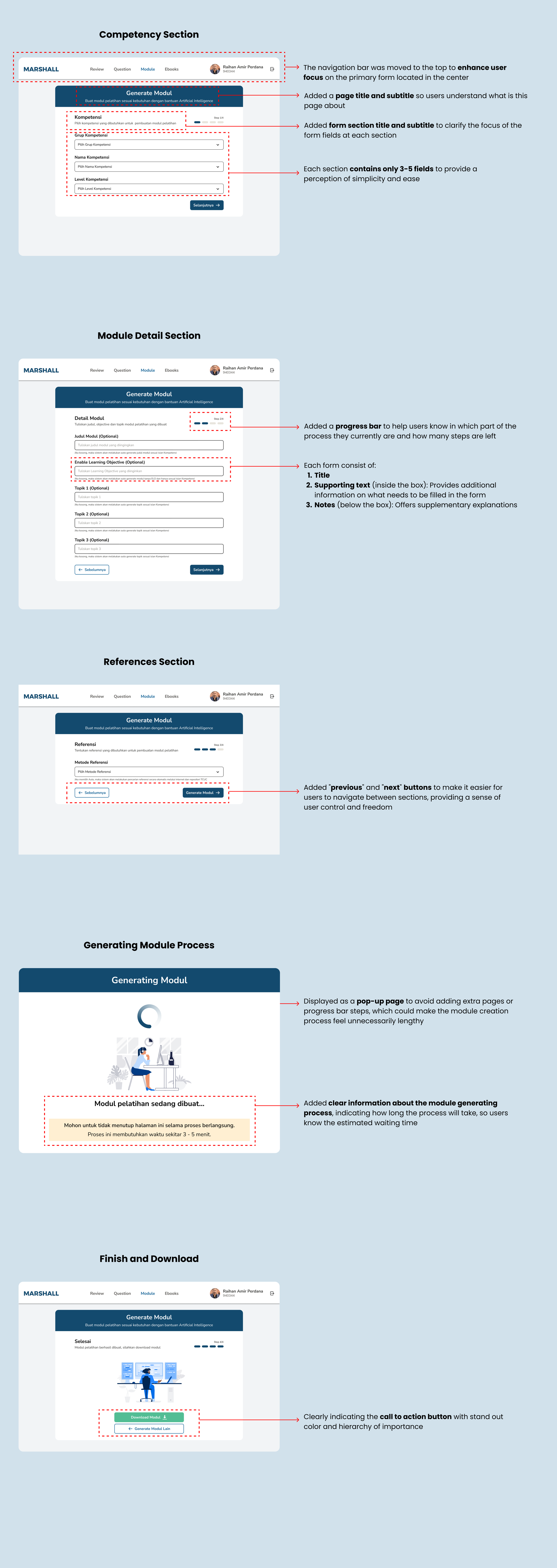
Key Design Decision
To simplify and clarify the purpose of each form field that users need to fill out when generating a learning module, I divided the 14 form fields into three sections grouped by similarity of importance (Competency, Module Details, and References).
This not only makes the process easier but also helps users avoid confusion, as each section contains only about 3-5 fields for them to be filled.
I ensured that each section is labeled with a clear title to help users understand the purpose of that part of the form.
Final Design
High Fidelity Prototype
Reflection
Personal Learnings
The primary challenge was the limited amount of time, which required me to carefully prioritize actions and decisions that would most effectively help me achieve my goals.
I would have preferred to conduct more interviews to gain deeper insights into the actual needs of trainers when generating learning modules.
Since this is only the first iteration, the next steps would involve conducting usability testing and A/B testing to evaluate whether the solution works effectively with these specific changes and implementations.